York University, Calumet & Stong Colleges (CCSC)
Unified Navigation: Redesigning Information Architecture
UX/UI Design
Web Design
Information Architecture
Timeline
4 Weeks, 2025
MY ROLE
UX/UI Designer
team
Coordinators, Communication Marketing Assistants

Overview
The original website was divided across three separate websites, forcing students to navigate inconsistent menus. By consolidating these into a single, unified navigation system, the project removed technical friction and improved content discoverability for all student success resources.
The Goal
The goal is to simplify the user journey and create a predictable experience. In the existing setup, the navigation layout changes completely when moving between college pages, creating significant cognitive load and user confusion.
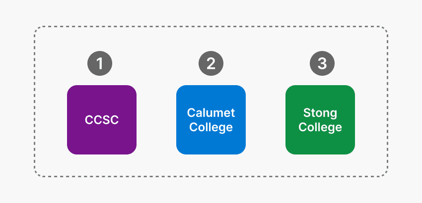
Unified IA Hierarchy
Solution Sketch
One website = One navigation
Before
3 separate websites, Multiple navigation systems, Inconsistent user experience.
After
1 unified CCSC website, 1 consistent navigation system, Cleaner and more intuitive structure.

Final Solution
Simplified Student Experience
01
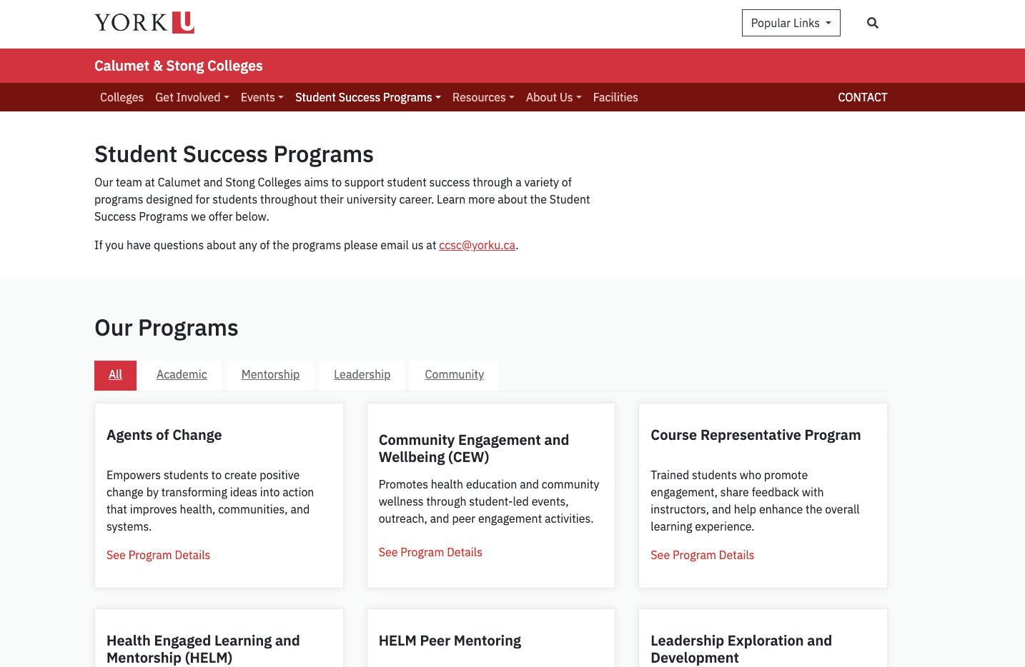
Consolidated Navigation
All resources from the three previous domains are now managed under one persistent menu, ensuring a single source of truth.
02
Prioritized Discoverability
Audited and restructured links to prioritize high-value content like student success programs and events, making them scannable at a glance.
Information Architecture Process
01
Audit
Identified and removed redundant links that contributed to visual overload.
02
Categorization
Grouped program-specific data into logical buckets (Support, Get Involved, Events) to ensure the system is easy to learn for new students.
03
Mapping
Defined a clear "parent-child" relationship between CCSC and the individual colleges to maintain a cohesive brand and functional identity.
Outcome
Key results
Simplified navigation menu
Consistent experience across all pages
Reduced number of pages
Removed outdated content
Improved user flow between pages