WiLLO
Financial Coaching App
UX/UI Design
AI Design
Product Design
Timeline
Sep 2025 - Dec 2025
MY ROLE
UX/UI Designer
team
Samantha Mirabella, Sharon Ou, Yashini Ravindran, Madhushree Ghosh

Project Overview
Personalized Financial Coaching App
Many individuals struggle to align their spending habits with their lifestyles, often leading to financial stress and irresponsible money management. Traditional budgeting apps focus only on tracking past expenses, offering limited guidance for future decisions.
WiLLo redefines personal finance by acting as an intelligent, automated financial coach. It helps users make better real-time spending choices, stay accountable to their goals, and adapt their budgets dynamically to life’s changing circumstances.
Research & Analysis
Key Challenges
How might we improve WiLLo’s usability and user experience make financial management more intuitive and engaging?
Thought our usability testing, we revealed key challenges that users often misunderstood terminology and struggled to interpret key information. Ambiguous wording and inconsistent tone led to confusion — users weren’t sure what data meant or how to act on it.
Our challenge was to redesign WiLLo’s language and interface to make financial information simple, intuitive, and emotionally supportive. The goal was not only to refine visuals but also to reshape the app’s communication.
Approach
UX Principles
To guide our redesign, our team of five designers established clear UX principles focused on clarity, empathy and adaptability.
Clarity
Simplify information hierarchy, visual structure.
Empathy
Create a tone that supports rather than instructions.
Adaptability
Make the app feel alive, changing with users’ goals and lifestyles.
Navigation
Before / After Redesign
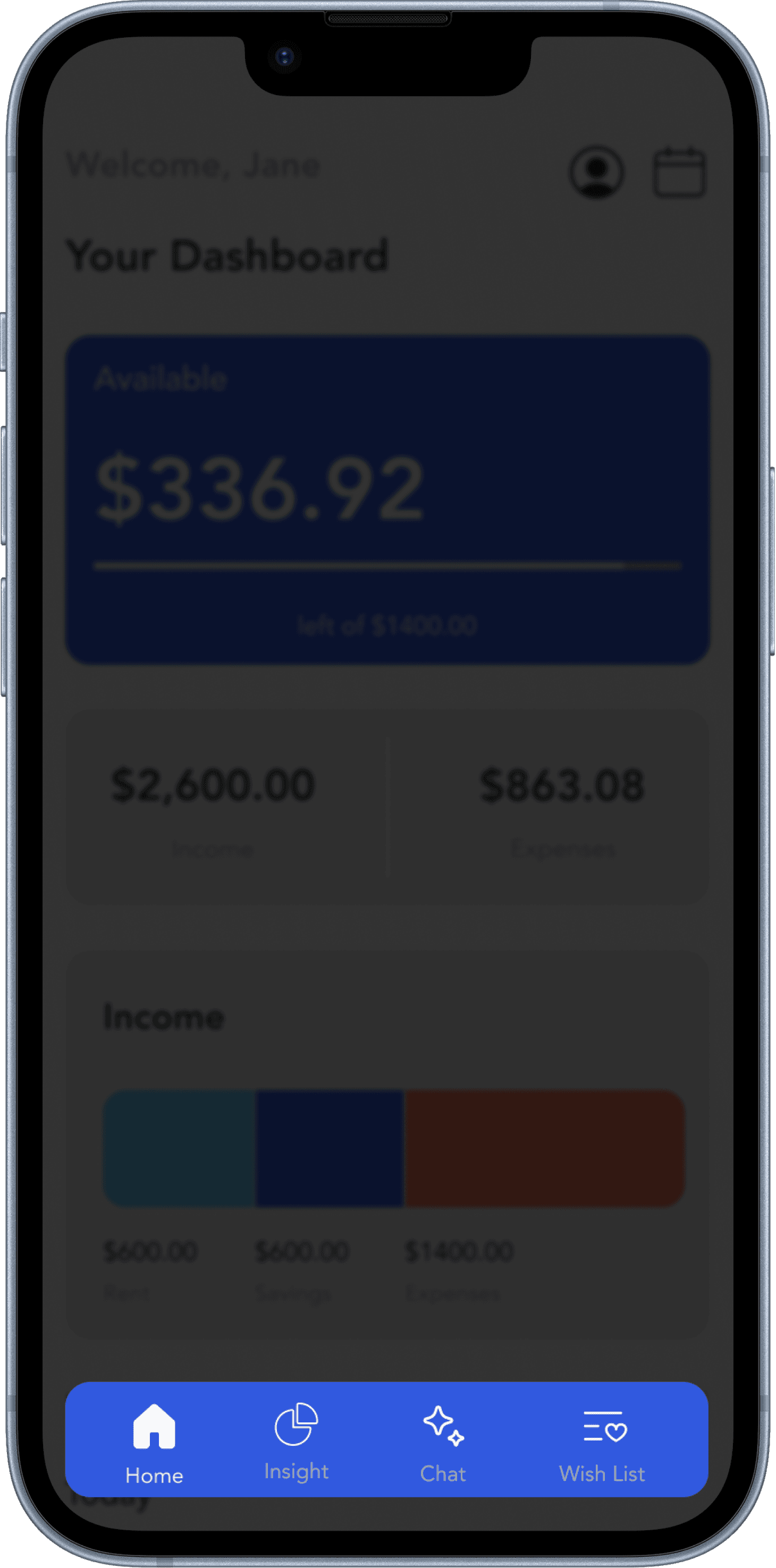

Before
Outlined icons lower the clarity.
Navigation bar labels are hard to read due to low contrast, makes the space busy, and not required.
After
Made the active state more visible and consistent with the overall app design.
Changed icons to make the context of each one more clear and self explanatory.
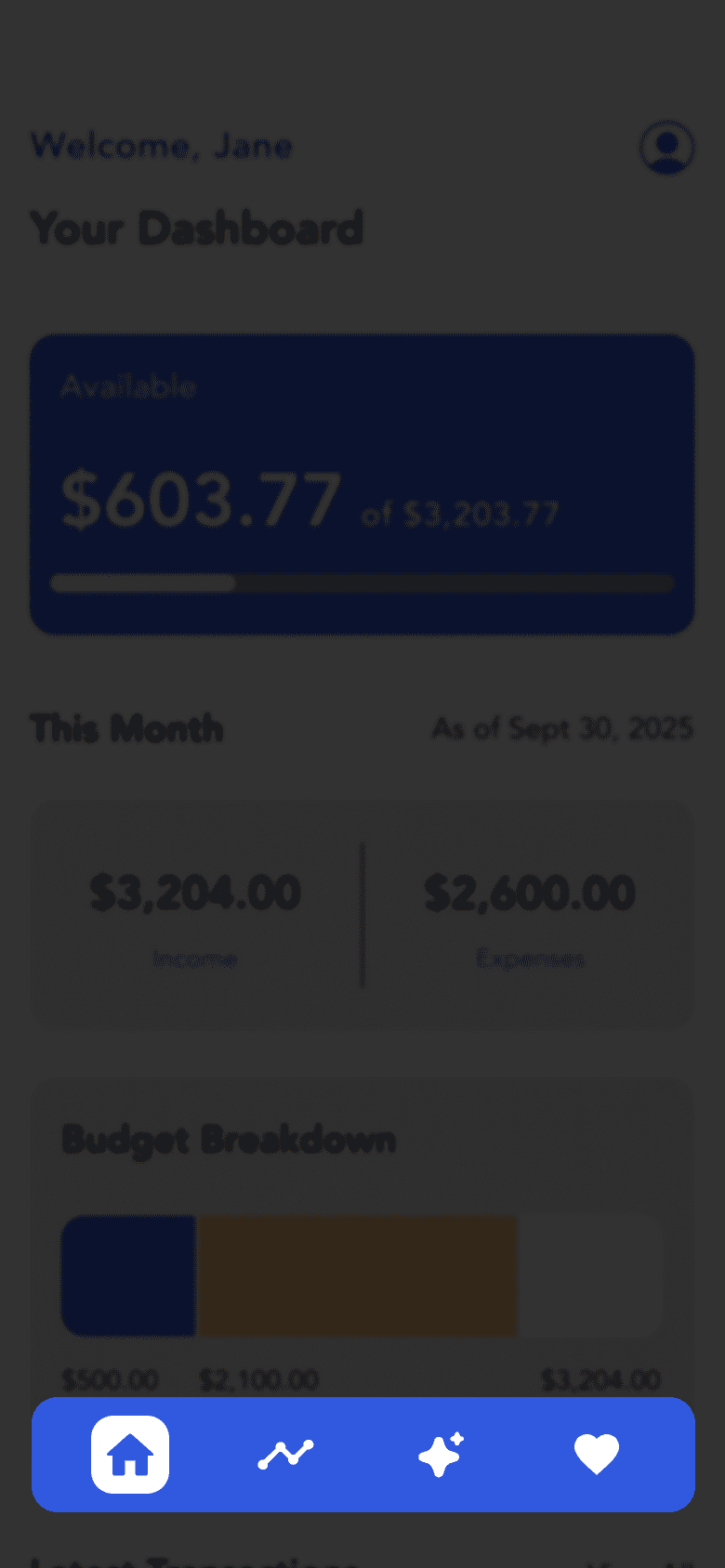
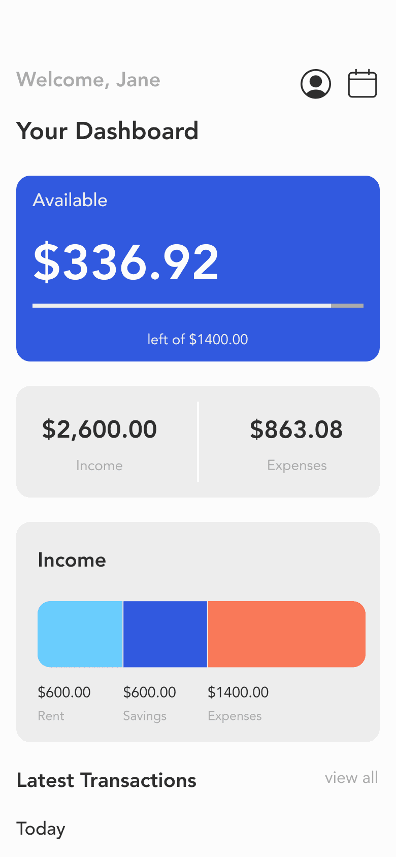
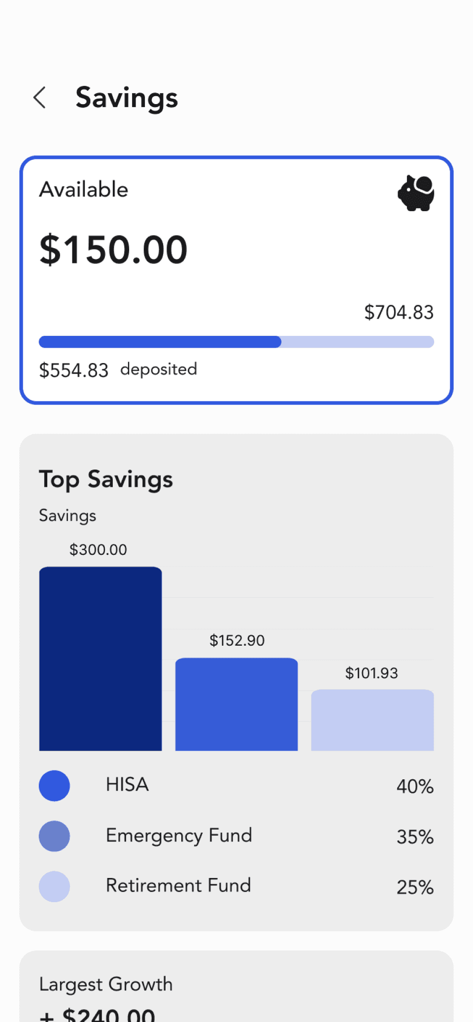
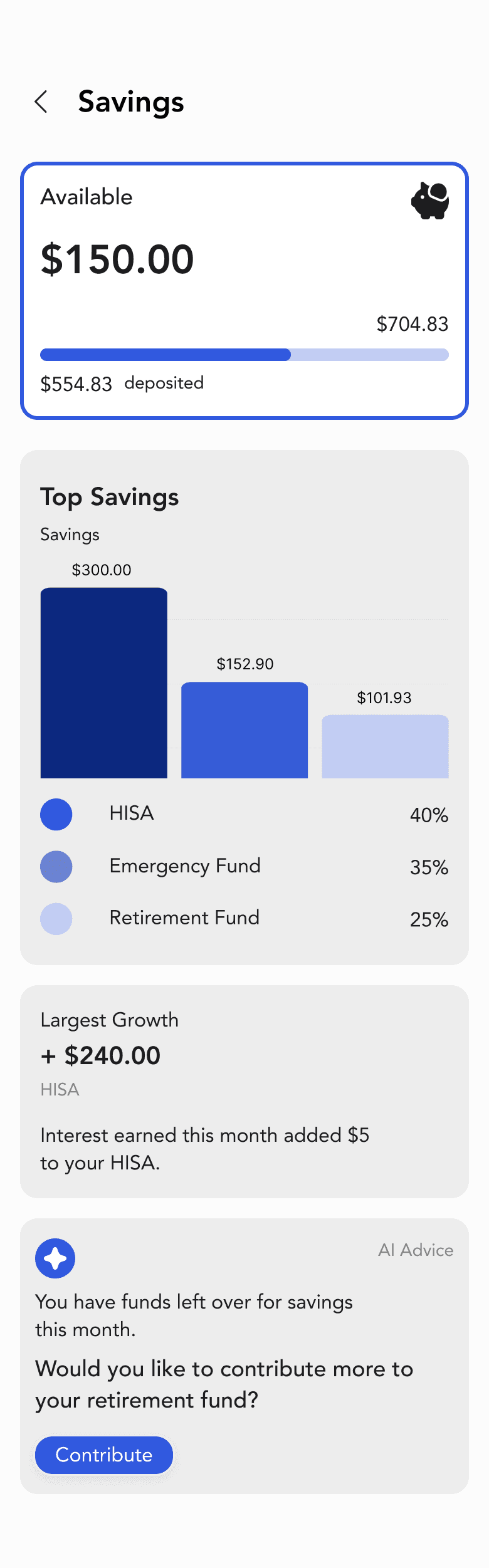
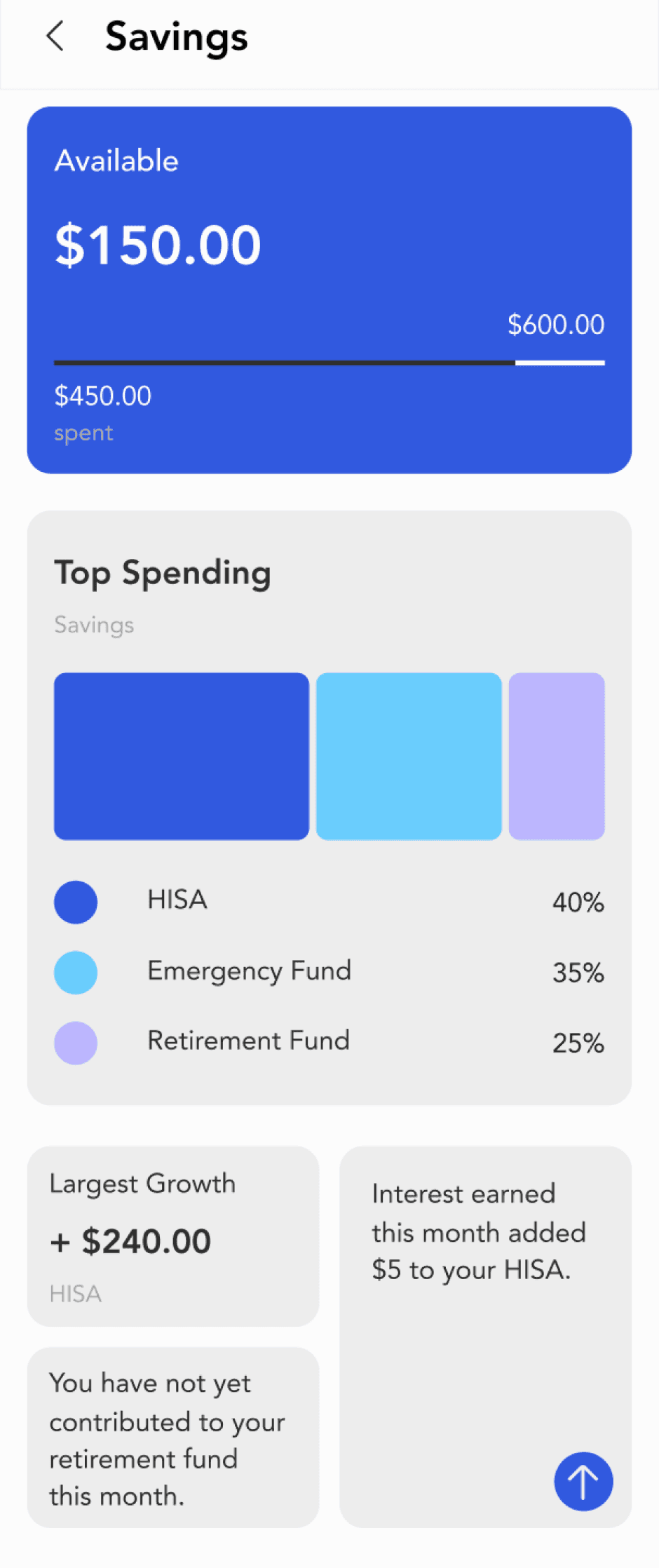
Main Dashboard
After
Before
Home
Insight
Chat
Wish List
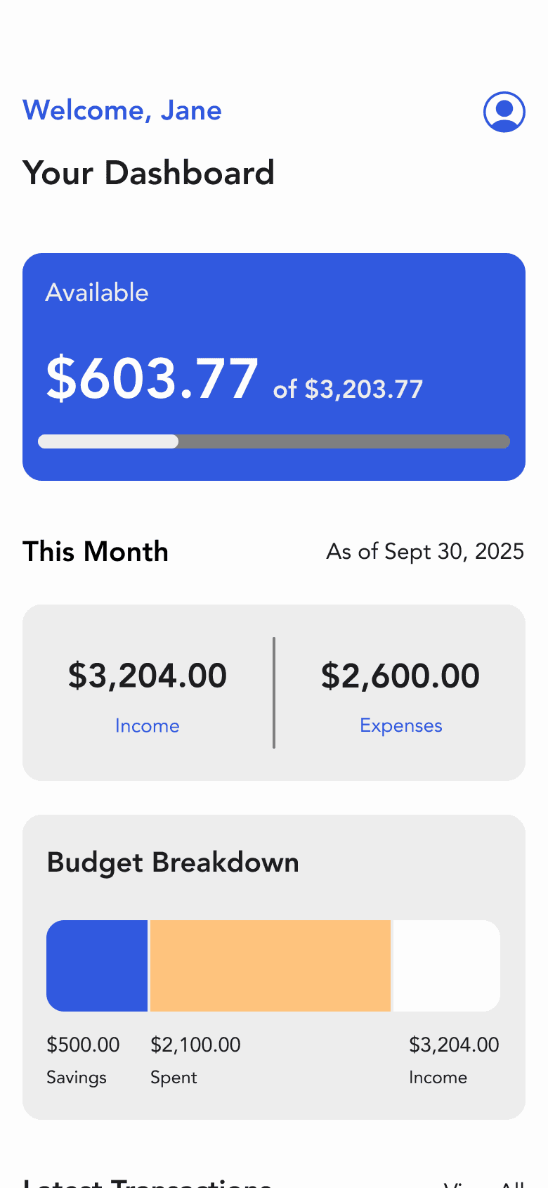
Adjusted content hierarchy.
Keep just one button to engage usability.
Added the heading and date for the user to be aware that the reports are accurate and up-to-date.
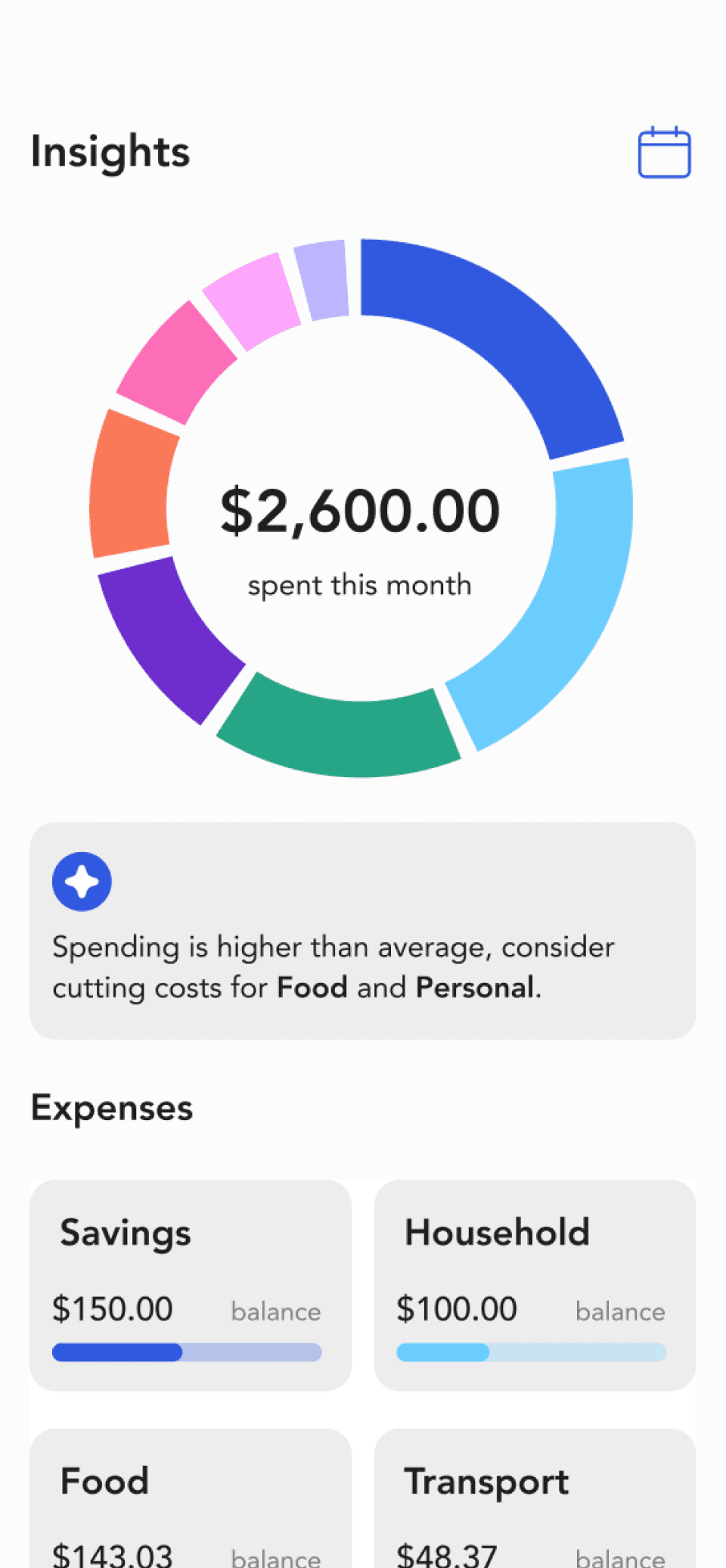
Visual breakdown to show how much money went to savings and how much was spent out of the user’s total income for the month.
Contrast issues on text.
Unclear context of the information.
Calendar
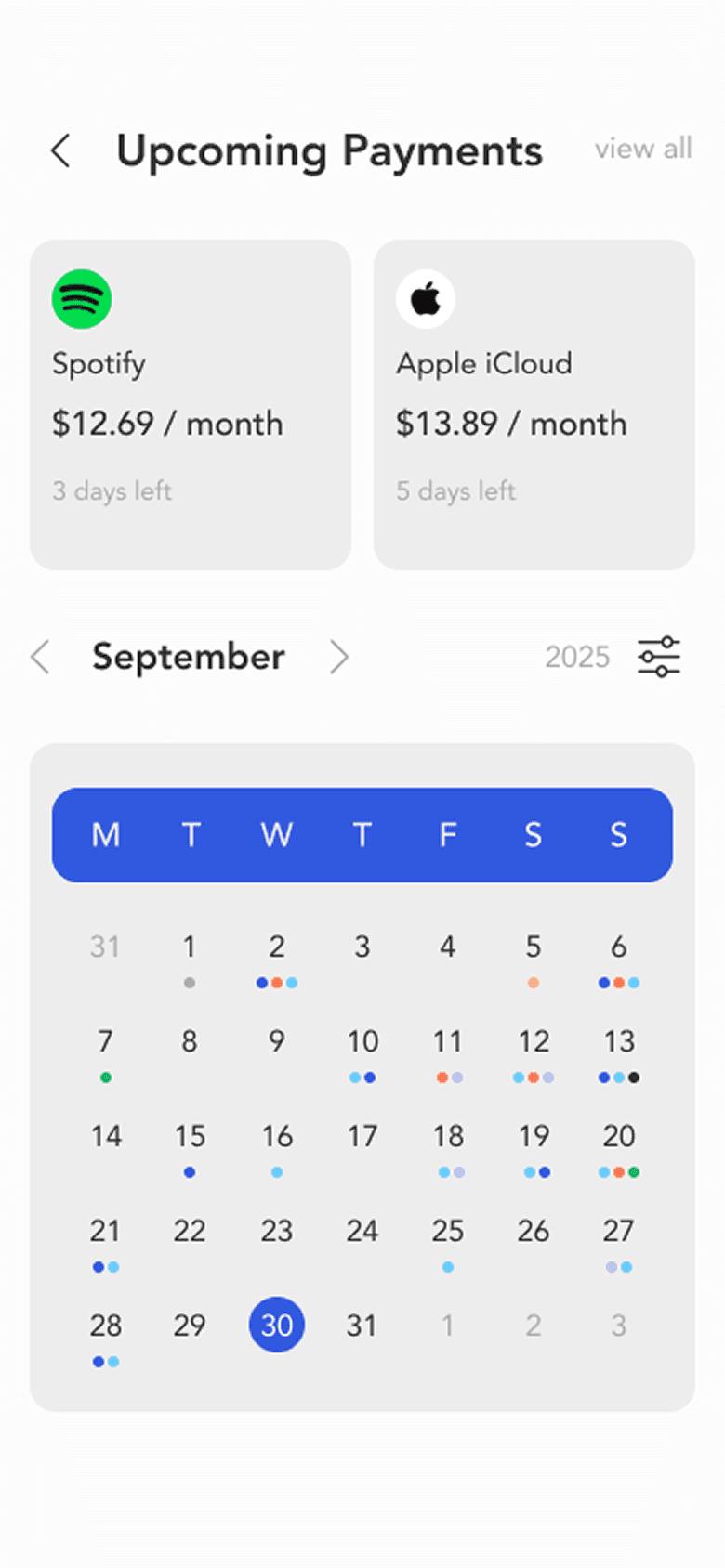
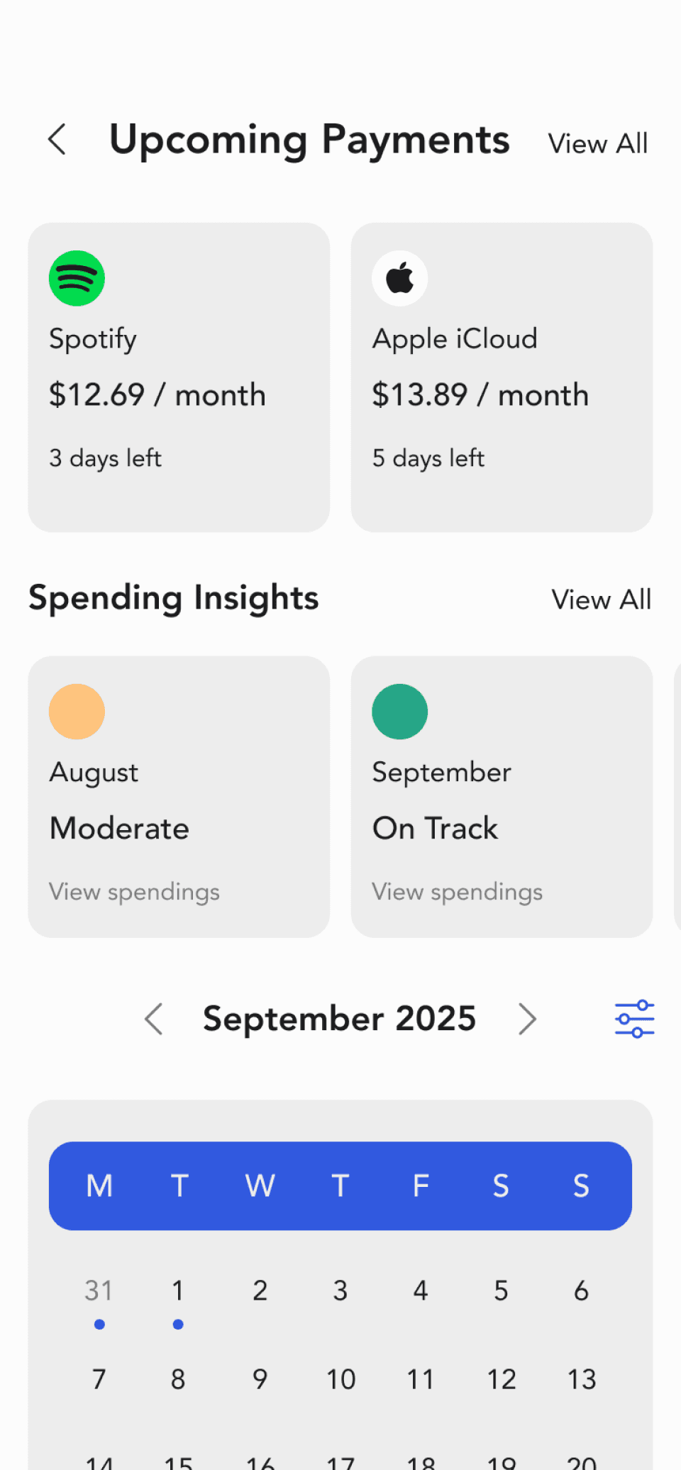
Intuitive Summary
Added insights to see how user is doing each month on their spendings.
Coloured indicators for each month gives the user an overview of how their spending habits were for
the month.
Reduced to one colour and indicates payment dates using the colour.
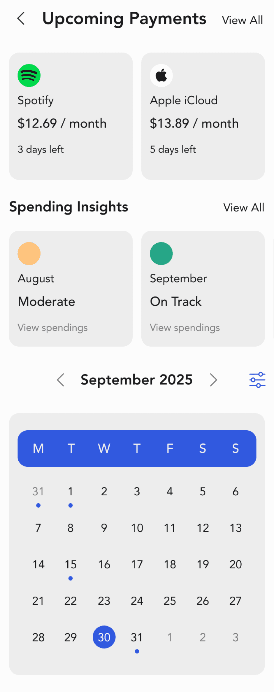
On Track
Moderate
Above Average
Too many colours for users to differentiate and too many payment dates on same days.
Contrast issues on texts
Calendar Upcoming Payments
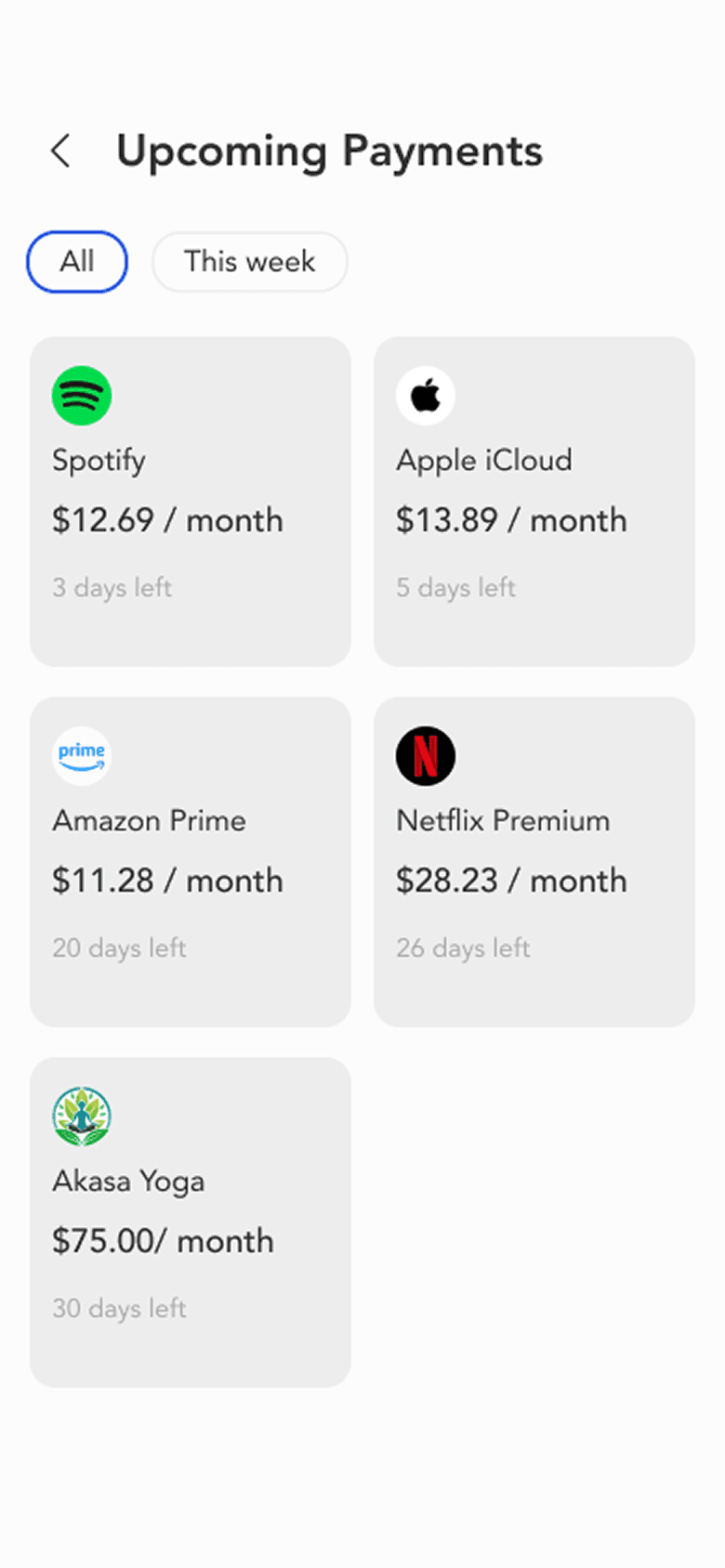
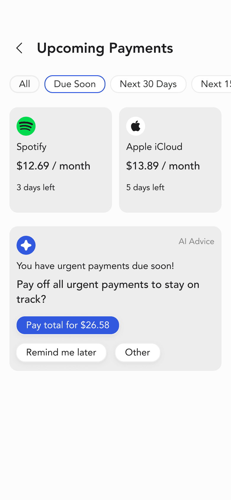
AI Advice
Added AI Advice section that reminds user to pay off all urgent payments to stay on track. It provides options to select based on their preferences.
Filters for users to select type of payment urgency.
No filters to differentiate urgency of payments.
Insights
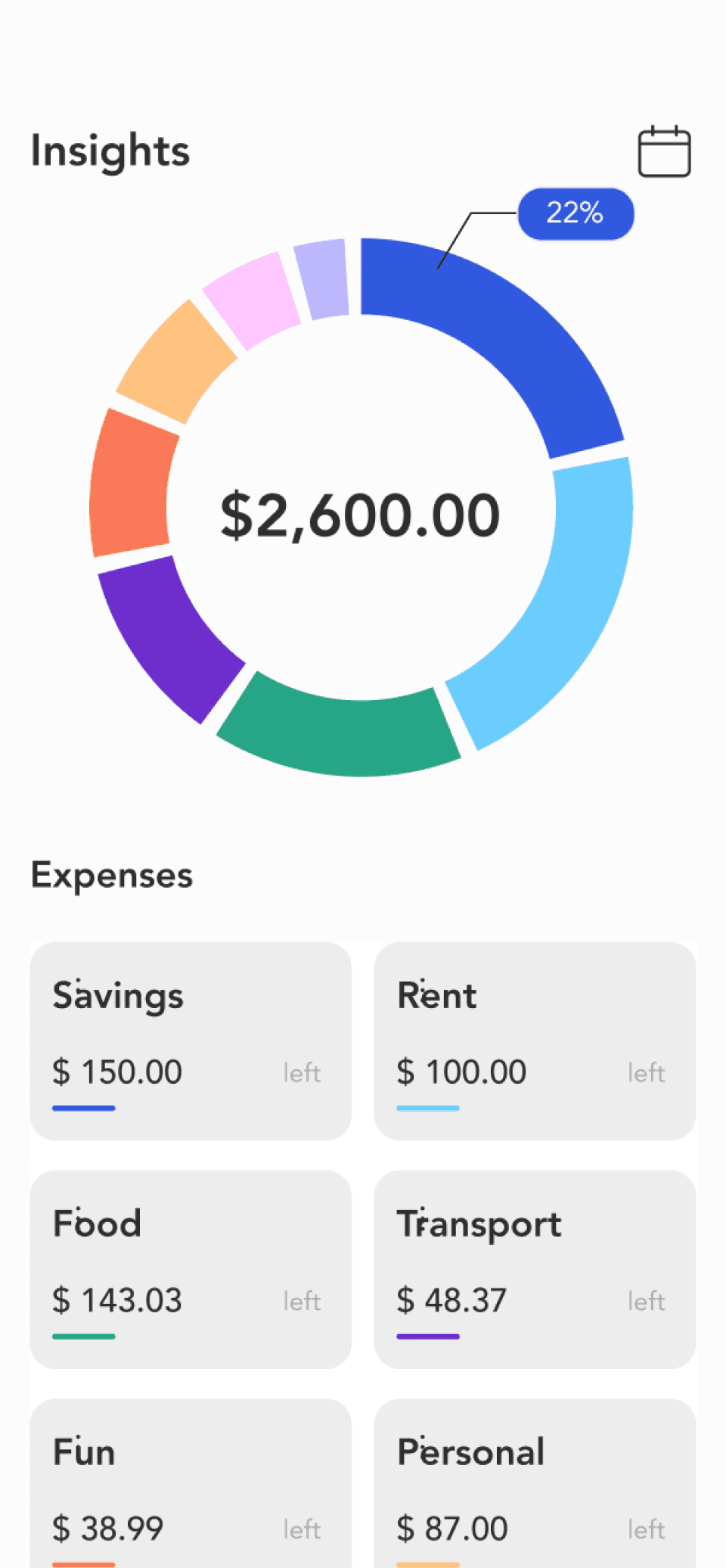
Clear Terminology
Replaced ambiguous terms: “Rent” with “Household”, “Left” with “Balance” to communicate meaning accurately.
AI Insight
AI provides an overall insight into their spendings for the month.
Unclear interpretation of what this number represents.
Colour shows categories
but can be leveraged to communicate information.
Thin bars are difficult to see.
Provides information context.
Insights Details
Visual Reinforcement
Using icons to give clear context to the category.
Using the bar charts with the exact amounts.
Balanced colour palette that reflects only the category. Darker bars indicates the highest amounts in a particular category.
Action oriented insights suggested by the AI.
Heavy usage of branding colour may confuse user as it appears on the detailed breakdown pages for all expense categories.
Visual information can be displayed more clearly to show differentiation.
Confusing colour usage
(colours used here are also used to represent other expense categories).
Lacks context and actions that users can take to improve their habits.
Wish List Achievable Soon
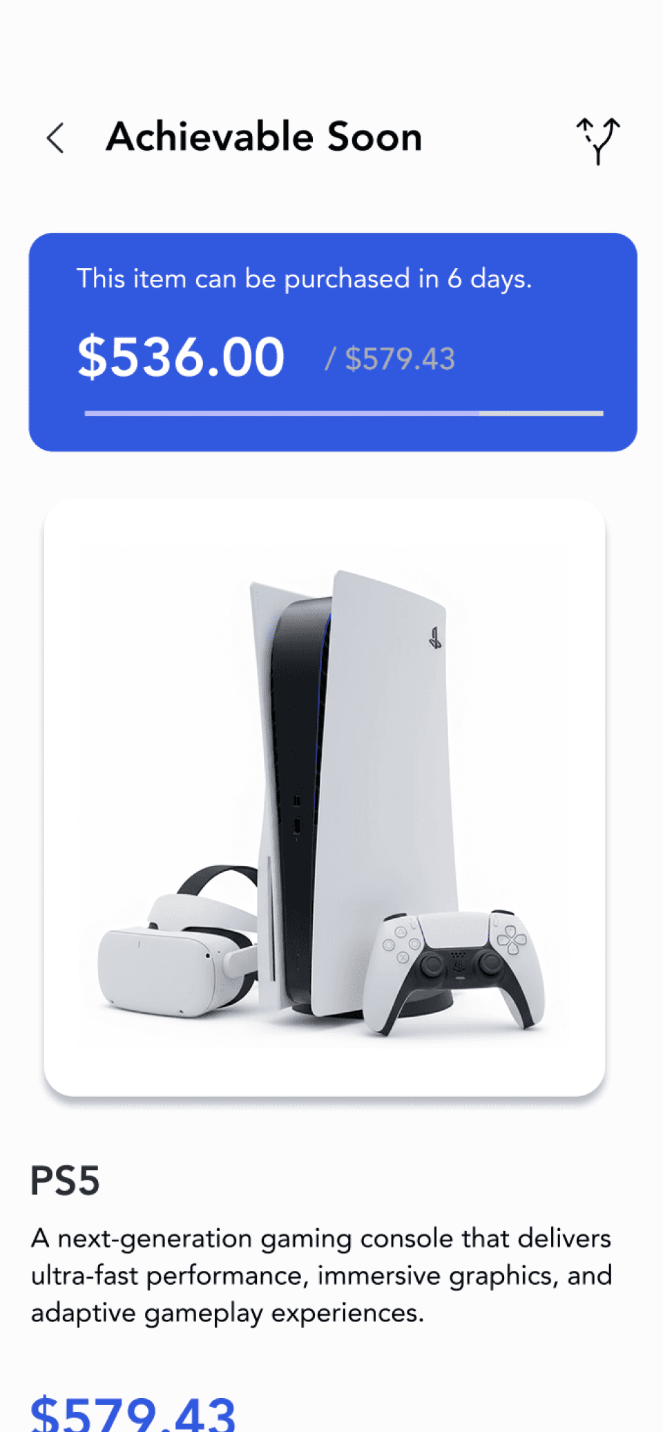
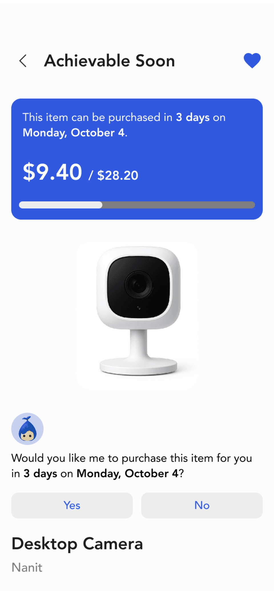
Highlights the number of days and the exact date the item may be purchased.
Larger size and higher contrast to improve visibility.
Used the universal icon.
Icon for viewing alternative options could appear unclear.
The bar is thin and the colour that fills the bar is difficult to see.
Goal-Oriented Coaching
When a product from the users wish list is achievable soon, WiLLO will ask if they want the item to be automatically purchased when it is achievable.
AI Chatbot

Extra Navigation Step. The mandatory "Chat with WILLO" button added a step.
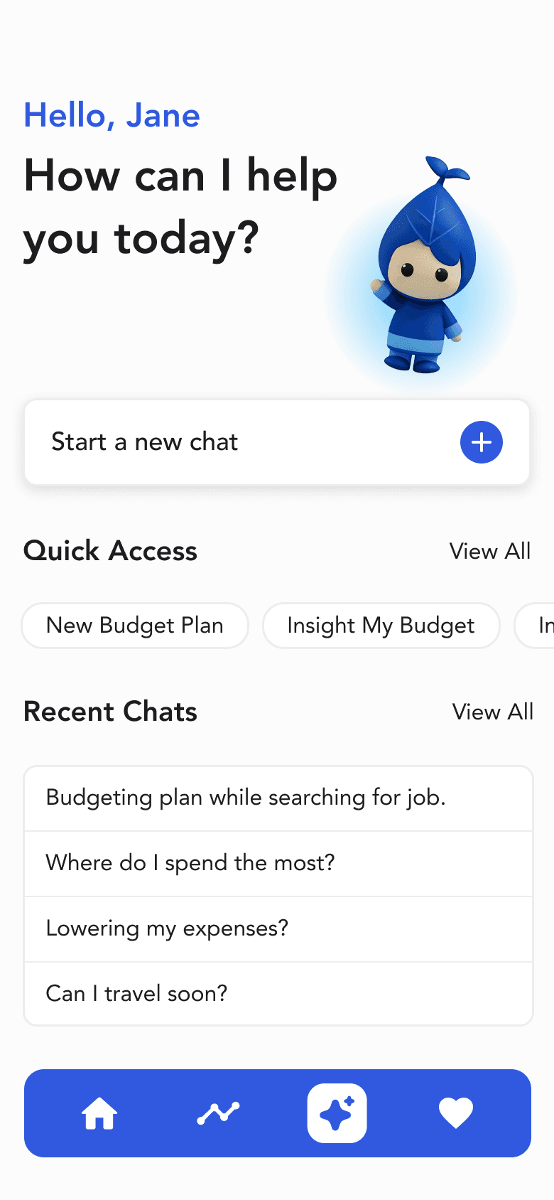
All-in-one Dashboard
Reduced unessential steps by giving users immediate control: start typing right away, access Quick Access tools and instantly view their Recent Chat history
AI Chatbot
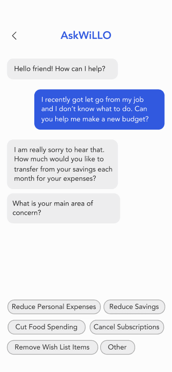
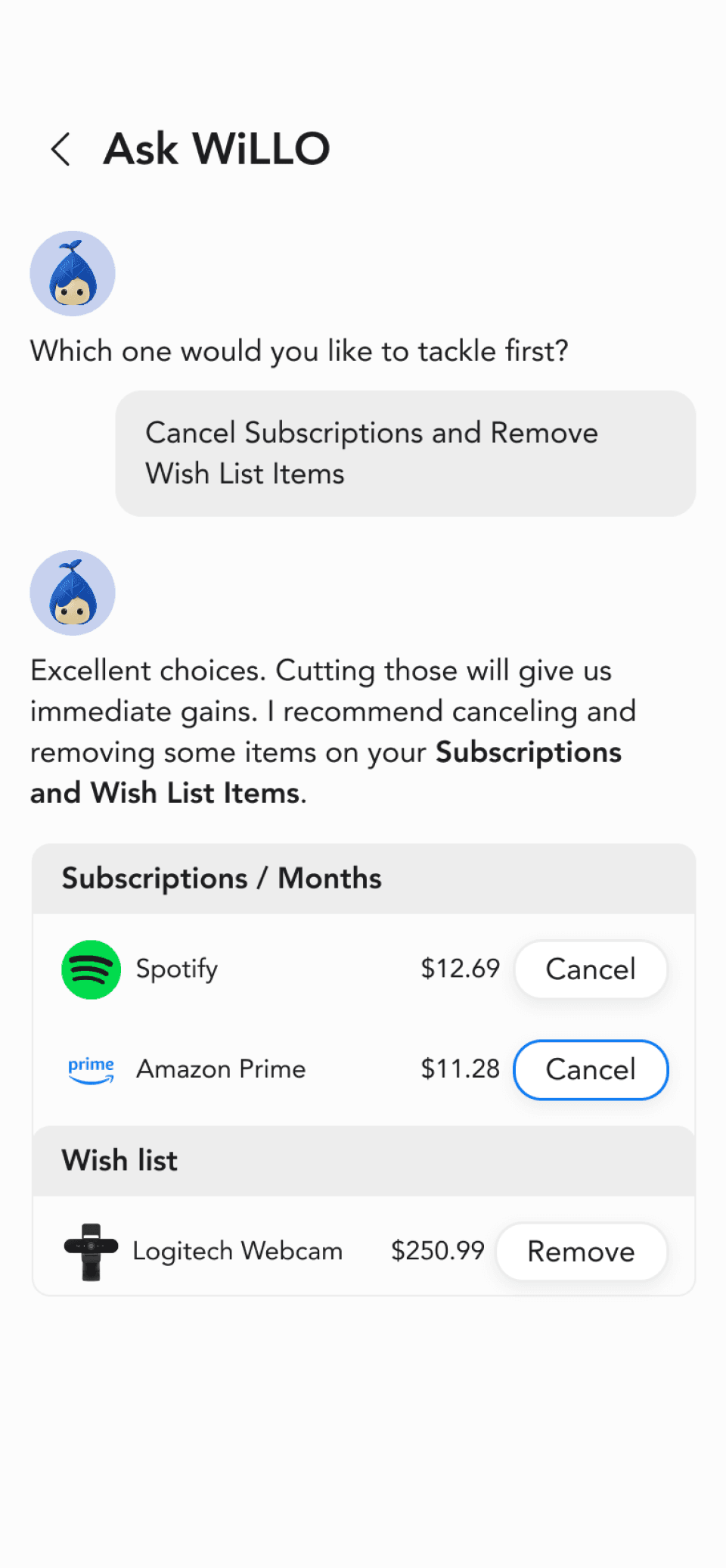
Proactive Automation
The AI provide alternative suggestions to user-driven action.
Prioritized visual hierarchy, utilizing elements like profile icons and charts to deliver results and minimize text-heavy output.
Heavy-text conversation. Lack of visual hierarchy.
Reflection & Learnings
A key takeaway
Through this project, I learned how clean, minimalist layouts, strong hierarchy, and clear visual contrast can reduce cognitive load and build user confidence. Consistent and simple language also played a critical role; words shape understanding, and clear terminology helps users feel grounded rather than uncertain. If given more time, I would conduct user testing with different levels of financial literacy to better understand how they interpret budgeting terminology and system guidance.